
The not-so-sticky footer problem
Haven’t you ever had that classic problem where the footer kept showing up in the middle of the screen? Here's an extremely simple solution for it using flex!


Haven’t you ever had that classic problem where the footer kept showing up in the middle of the screen? Well, we’ve all been there. Call it “the belt” or whatever you want but I’m sure you spent a lot of time trying to correct it and nothing seemed to work. Anyway, good news! Flex’s here to help you out!
Let's tighten your belts!
First and foremost, let’s see a concrete example:
<div class="app">
    <header/>
    <main/>
    <footer/>
</div>
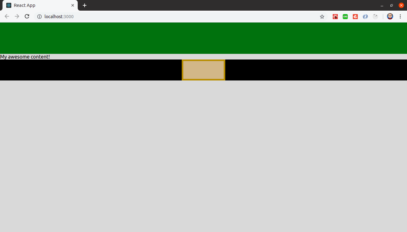
Let’s say your app involves a header, a footer and the main content between them. The problem arises when the content is not long enough to make the footer stick to the bottom of the page, consequently looking similar to this one:
Flex to loosen up!
It looks like a belt, right? Ok, how can we take this “belt” away with flex? Here’s all the CSS we need.
.app {
  display: flex;
  flex-direction: column;
  min-height: 100vh;
}

main {
  flex-grow: 1;
}
Let’s describe what each line means.
-
display: flex means that the main container (the app component) will be a flex container. This way, a lot of flex properties can be used on it or its children.
-
flex-direction establishes the main-axis. Think of flex items as primarily laying out either in horizontal rows or vertical columns. Its possible values are
row(left to right),row-reverse(right to left),column(top to bottom) andcolumn-reverse(bottom to top). -
min-height: 100vh makes the app container occupy the whole screen. Viewport units are porcentual and relative to your screen. Vh stands for viewport height, so 100vh means to take the 100% of the screen height as a value. Otherwise, its height will be just the height used by its children in total. In the vertical direction, you need to specify a height for the container. This is different from the horizontal direction, which automatically expands to fit.
-
flex-grow: 1 is super important here and the fact that we are applying this property only to the content (component between header and footer) and not to the header nor to the footer is also crucial. Let’s dig into this a little bit more.
What flex-grow does is to define the ability for a flex item to grow if necessary. It determines what amount of the available space inside the flex container the item should take up. For example, let’s say we have six squares and each of them has flex-grow: 1. The container is thus divided into six separate sections. Each square grows to fill 1/6 of the available space in the container. But what happens if only square #3 sets its flex-grow to 2? The container is now divided into seven different sections and square #3 gets 2/7 of that space and the others 1/7 of it. And so on. Flex-grow is all about proportions. If we set every square to flex-grow: 4, and square #3 to flex-grow: 12, we’d get the same result as if it were 1 and 3.
Furthermore, the default value is 0 to every item. And that is why we set a value of 1 to only the content. The content would say something like: “Hmm, it looks that I’m the only one playing the flex game so I’ll go ahead and take all the available space”. This is what makes the header and the footer take only their auto size.
Sticking down, summing up!
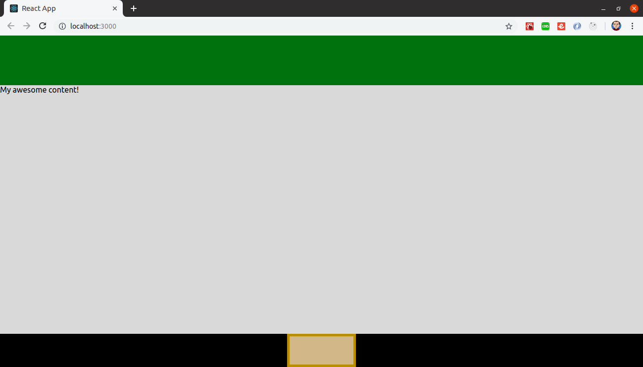
Finally, the result is this:
To sum up, there are other ways in which you can accomplish this. However, I consider this one a pretty straightforward approach. That’s all by me, have a nice flexbox-ish day!
If you don't get on well with CSS, you might find this post very helpful.
If you want more information about flexbox here are some useful links:
- Flexbox properties: https://css-tricks.com/snippets/css/a-guide-to-flexbox/
- Flex-grow, flex-shrink, flex-basis (properties that are usually not well explained): https://medium.freecodecamp.org/even-more-about-how-flexbox-works-explained-in-big-colorful-animated-gifs-a5a74812b053
- Flexbox game: https://flexboxfroggy.com/