Responsive design with CSS grid and kittens
If you ever heard about CSS grid and how it can help you make responsive designs but you haven't tried it yet or you don’t know where to start, join us in the construction of a responsive design with grids and kittens!

If you ever heard about CSS grid and how it can help you make responsive designs but you haven't tried it yet or you don’t know where to start, join us in the construction of a responsive design with grids and kittens!
Si querés leer este post en español, clickeá acá.
From the Design to the Code
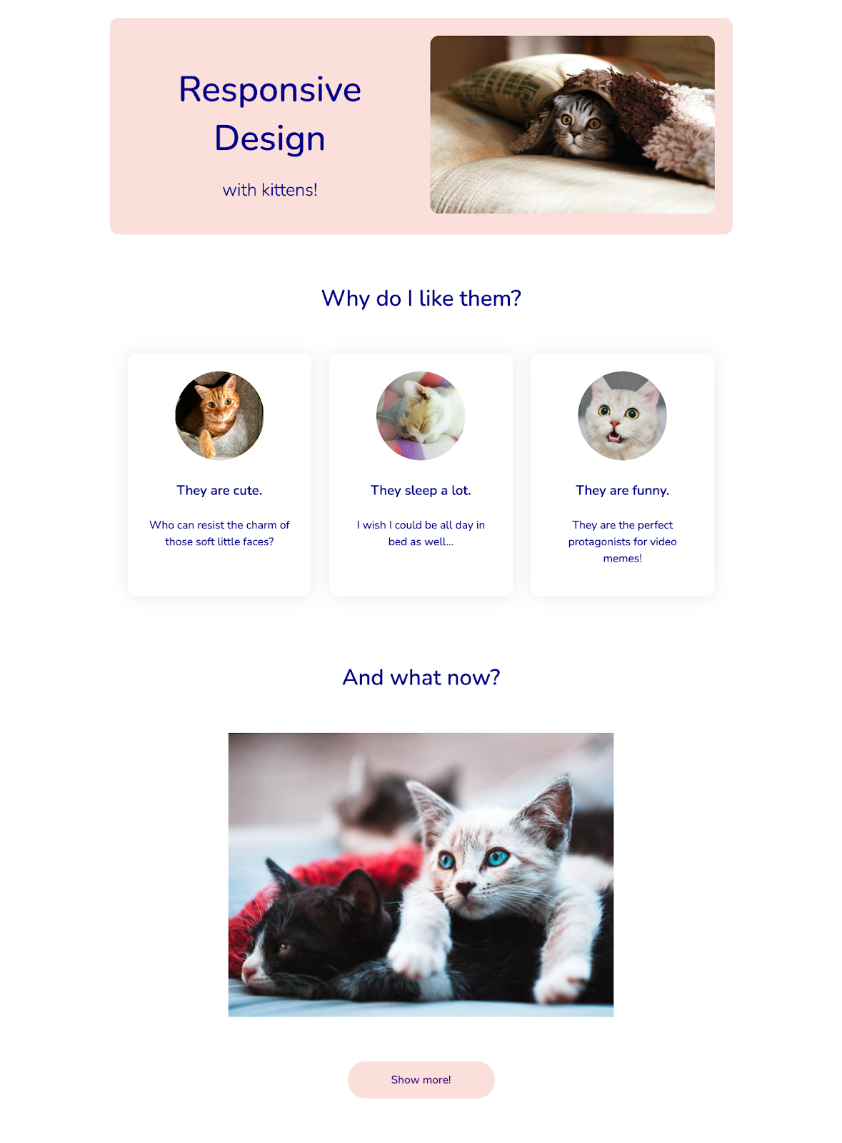
Suppose we want to build a website about kittens by replicating the following design:
So, where do we start?🤔
Taking a look at the structure we can see that the design has three large sections: the first one is a pink container with a title, a subtitle and an image. Let’s go in order: we’ll start by modeling the basic structure for this section in HTML and CSS, which for now will only have a single grid of twelve columns.
<!-- grids-and-kittens.html -->

<section class="intro">
  <div class="grid">
    <!-- Here we’ll include the title, the subtitle and the image -->
  </div>
</section>
/* styles.css */

.grid {
  box-sizing: border-box;
  display: grid;
  grid-gap: 2rem;
  grid-template-columns: repeat(12, 1fr);
  margin: 0 auto;
  max-width: 70rem;
  width: 100%;
}
As you can see in the CSS file, we are going to create our grid using display: grid and adding the property grid-template-columns, which defines the size of the columns. The rest of the properties are simply giving additional styling for the grid to be at most 70rem wide and centered in relation to the browser.
Let’s pay attention for a moment to the value repeat(12, 1fr). What does this mean exactly? The fr unit refers to a fraction of the available space within the grid and repeat is a function which allows us to determine how many times a measurement is repeated (for example, repeat(3, 1fr) is the same as writing 1fr 1fr 1fr).

Wow Wow, Slow Down EggHead. Why do we need to repeat this value? Well, the most common usage of the grid-template-columns property is to assign a series of values that will define how many columns my grid will have and how wide will each one be. Hence, if I assign the values 10rem 15rem 12rem, I’ll obtain as a result a grid with three columns (with width-size 10rem, 15rem and 12rem respectively). While using repeat with the values 12 and fr, basically what I’m writing is “divide the total width from my grid in 12 columns equally”
And why 12? Couldn’t it be 2, 5 or 83? Of course it could! But in this example we use 12 as it provides us with flexibility, since having many divisors allows us to easily fraction our design in 1, 2, 3, 4, 6 or 12 columns, or even other combinations if we don’t need them to be the same width 🤯
If we look again at the design and try to divide it in 12 columns we can see that (conveniently for this article 😜) several of the elements have a size related to a number of columns.
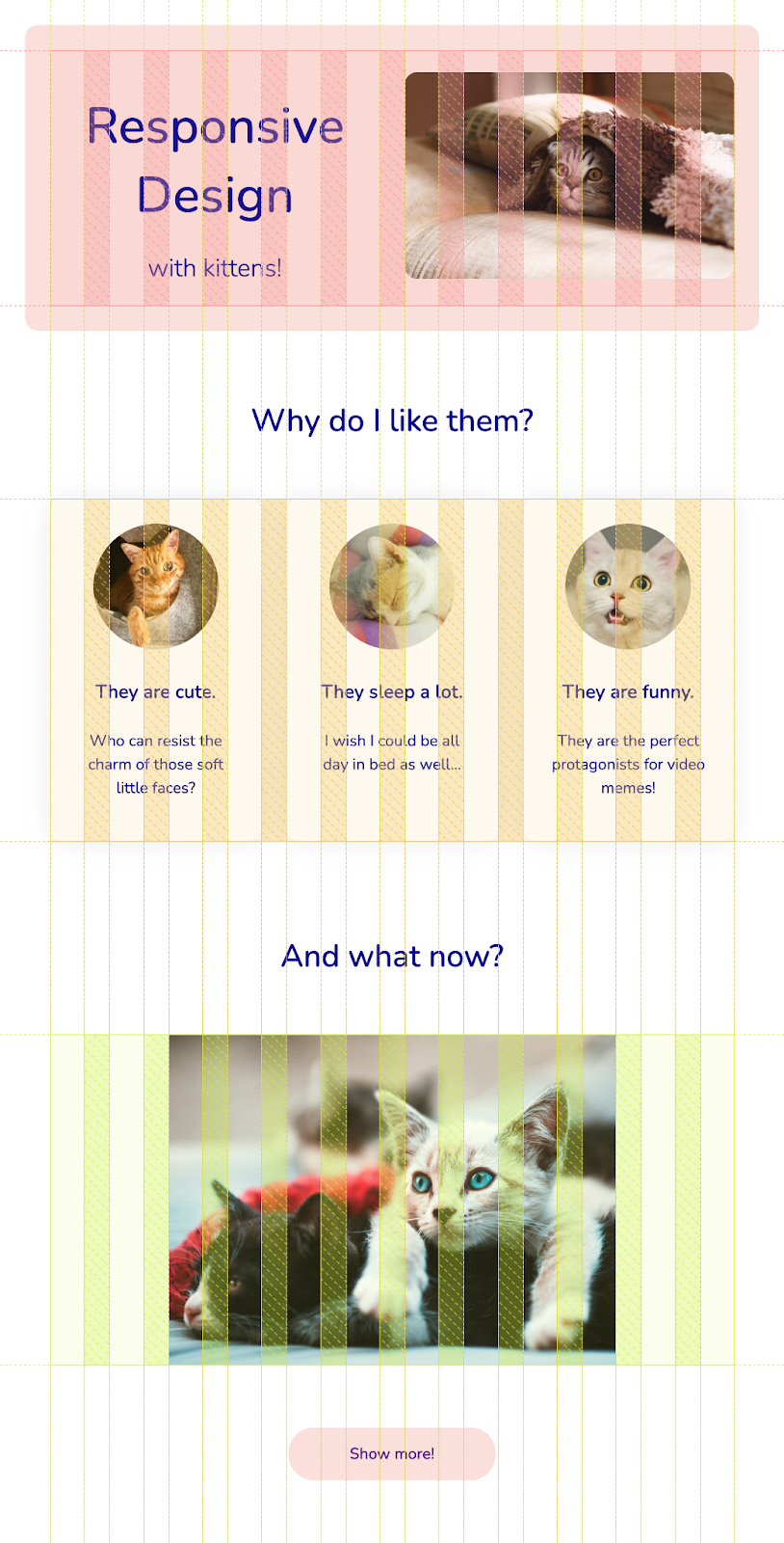
For example, the picture from the introduction section is 6 columns wide and each of the 3 cards from the second section is 4 columns wide. This heuristic of measuring the widths of the elements in columns is the one we are going to use to build our website.
First Section
Now that we understand a little bit better how our web page is structured, let’s continue by adding the internal elements for the first section. We could say that there will be two containers in it: one containing the title and subtitle and another one that is going to have the image of the kitten.
As a result, our section will look like this:
<!-- grids-and-kittens.html -->

<section class="intro">
  <div class="grid">
    <div class="grid">
      <div class="container">
        <h1 class="title">Responsive Design</h1>
        <h2 class="subtitle">¡with kittens!</h2>
      </div>
      <div class="container">
        <img class="kitten-image" src="kitten-from-intro.jpg" alt="Kitten under a blanket"/>
      </div>
    </div>
  </div>
</section>
If we observe how our layout is coming along, we’ll see that our containers are filling a column within our grid (that’s good!) but they aren’t occupying half of the section width as we would want (that’s bad!)
To solve this problem we are going to explicitly tell the code that each container must be expanded along 6 columns of the grid (half of the total of 12) by adding the property grid-column-end: span 6 to each one of them.
/* styles.css */

.container {
  grid-column-end: span 6;
}
In addition, if we add a little more styling to the section, the grid and the internal elements, the new rules would look like this:
/* styles.css */

:root {
  /* We use variables from CSS to reuse them easily in the colors */
  --main-color: #FADFDB;
  --secondary-color: darkblue;
}

body {
  color: var(--secondary-color);
  /* To use this font, first you’ll need to embed it in your code */
  /* You can find it in Google Fonts : https://fonts.google.com/ */
  font-family: 'Nunito', sans-serif;
  margin: 0;
  padding: 2rem;
}

.grid {
  grid-gap: 2rem;
  padding: 2rem;
}

.intro .grid {
  align-items: center;
  background-color: var(--main-color);
  border-radius: 1rem;
  text-align: center;
}

.kitten-image {
  border-radius: 1rem;
  width: 100%;
}

.title {
  font-size: 4rem;
  font-weight: 500;
  margin-block-end: 1rem;
}

.subtitle{
  font-size: 2rem;
  font-weight: 300;
}
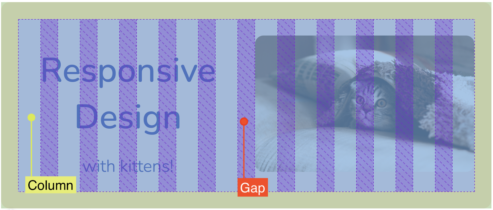
Among these rules (more precisely within the style of the grid), we used another CSS grid concept: grid-gap, which allows us to set the size of the gap between columns and rows from the grid. With this property, we can ensure that there is some space between the internal elements of the grid. If you inspect the introduction section with Developer Tools, you’ll be able to observe the columns and the gaps.
Second Section
Let’s start enumerating the reasons why we like kittens! We’ll need a new section, with a title and a grid, inside of which we’ll create the three cards with different motifs.
<!-- grids-and-kittens.html →

<section class="reasons">
  <h3>Why do I like them?</h3>
  <div class="grid">
    <div class="card">
      <!-- Don’t forget to complete the alt attribute -->
      <!-- to improve the accessibility of the webpage -->
      <!-- https://webaim.org/techniques/alttext/ -->
      <img src="cuties.jpeg" alt="Cute Kitten in its bed"/>
      <h4>They are cute.</h4>
      <p> Who can resist the charm of those soft little faces?</p>
    </div>
    <div class="card">
      <img src="sleeping.jpeg" alt="Sleeping Kitten"/>
      <h4>They sleep a lot.</h4>
      <p> I wish I could be all day in bed as well...</p>
    </div>
    <div class="card">
      <img src="funny.jpeg" alt="Kitten with a funny face"/>
      <h4>They are funny.</h4>
      <p>They are the perfect protagonists for video memes!</p>
    </div>
  </div>
</section>
The most important aspect in this part of the design is to be able to show the 3 cards in just one line of our grid, which is why we are going to make them take up only a third of the total number of columns, that is, 4 columns each one. How? With our already well-known friend grid-column-end! If we also add additional styles, the CSS will look like this:
/* styles.css */

.reasons {
  padding: 3rem 0;
  text-align: center;
}

.card {
  border-radius: 1rem;
  box-shadow: rgba(0, 0, 0, 0.08) 0 0 2rem;
  grid-column-end: span 4;
  padding: 2rem;
}

.card img {
  /* To make the image within the card look rounded */
  border-radius: 50%;
  max-width: 10rem;
  width: 100%;
}

h3 {
  font-size: 2.5rem;
  font-weight: 500;
}

h4 {
  font-size: 1.5rem;
  font-weight: 700;
}

p {
  font-size: 1.25rem;
  line-height: 150%;
}
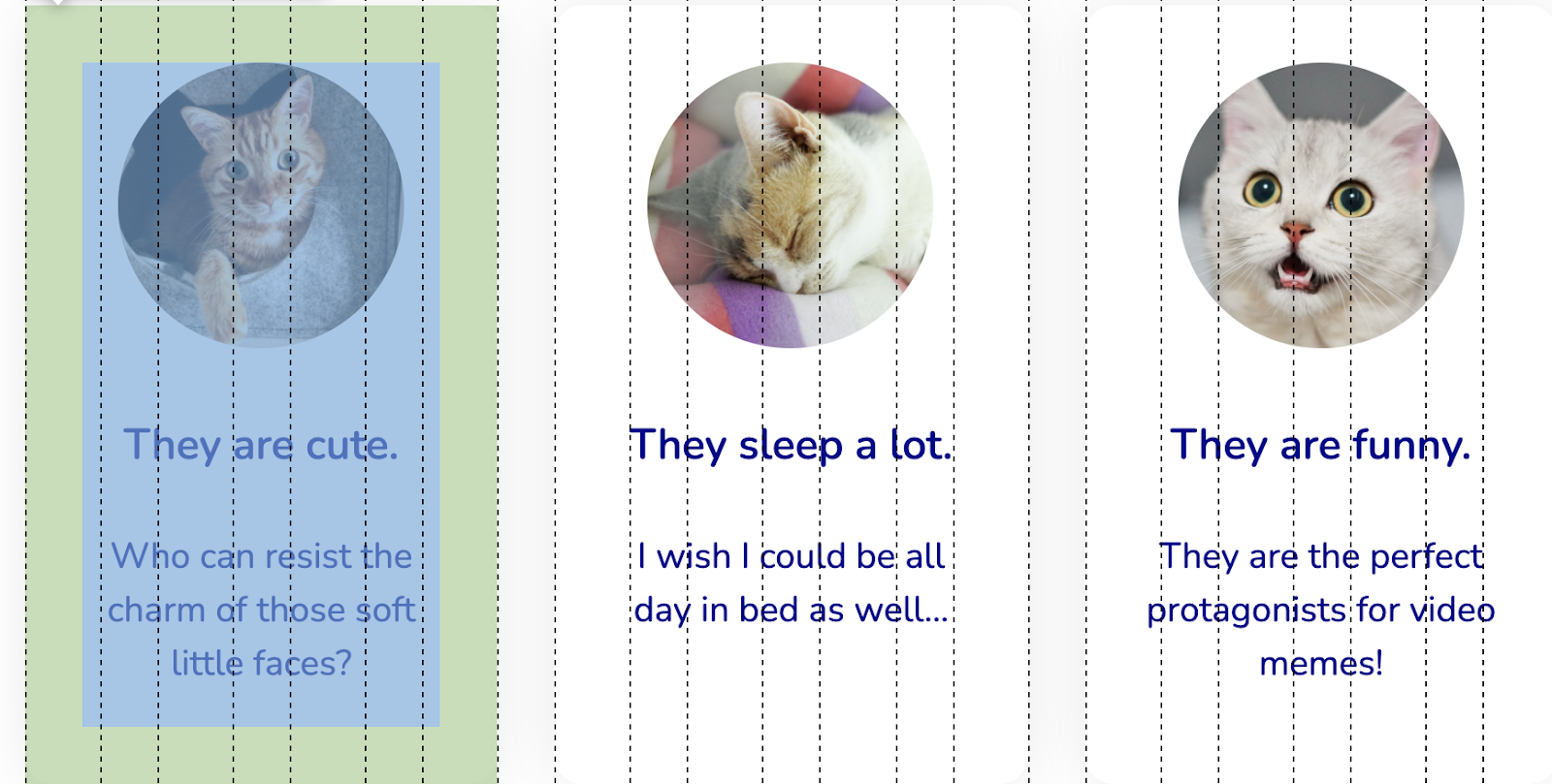
Once again, you can inspect the HTML and see that the cards now take up 4 columns each 🕵️♀️
Third Section
Let’s move on to the last part of our design! As you can probably imagine, we’ll need a brand new section with all of its components.
<!-- grids-and-kittens.html -->
<section class="what-now">
  <h3>And what now?</h3>
  <div class="grid">
    <img
    	class="show-more"
        src="kittens-laid-down.jpeg"
        alt="Two kittens lying down on top of each other"
    />
  </div>
  <!-- Unsplash is a freely distributed image bank-->
  <!-- You can use your photos without worrying about copyright!  -->
  <a href="https://unsplash.com/s/photos/cat" target="_blank">Show more!</a>
</section>
A key thing to keep in mind for the style of this section, is that the photo takes up a proportion of two thirds of the total width of the grid, i.e. 8 columns. What will we use to achieve this width? You guessed it! Our old-friend grid-column-end. However, this time there is an additional detail and it is that our picture is centered relative to the grid. That’s why we shouldn’t only specify how many columns it should fill but also where to start drawing; for this we’ll use grid-column-start. It is important to take into account that the property expects to receive the number of the grid line in which the element will start to be drawn and also that it starts counting from line 1.
Now, how do we know which exact line to pick? 😱 Well, if we consider the image is going to take up 8 columns and that the total is 12, we have 4 free columns left. Then, if we want for the image to be centered, what we would like to achieve is to have 2 empty columns at each side of the image. We can deduce that we want the container to start alongside the third column (i.e, line three), as we can see it in this image:
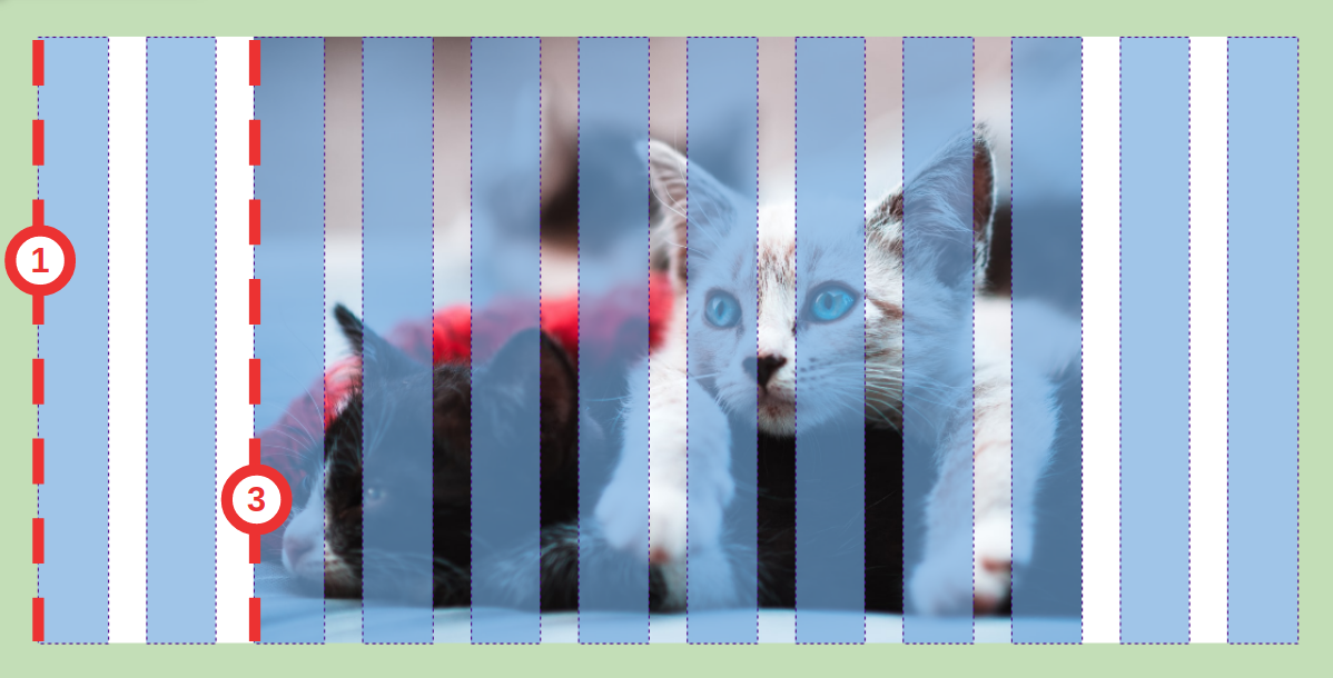
If we translate this to CSS (adding some styling touches), we’ll have the following code:
/* styles.css */

.show-more {
  grid-column-end: span 8;
  grid-column-start: 3;
  width: 100%;
}

.what-now {
  text-align: center;
}

a {
  background-color: var(--main-color);
  border: 4px solid var(--main-color);
  border-radius: 2rem;
  display: block;
  font-size: 1.25rem;
  font-weight: 500;
  padding: 1rem 2rem;
  margin: 3rem auto;
  text-decoration: none;
  width: 12rem;
}

a:hover {
  background-color: white;
}
Our model is (almost) finished 🎉
And where is the responsiveness?

For the page to look good on mobile devices, we just need to do some minor adjustments using media queries. A simple solution is to make each of the child components of the grid fill the entire available width instead of a portion of the grid (this is because we have less space than in desktop resolution). Moreover, we are going to delete the gap in between columns (since we know that we will not have elements inside that we want to distance) and keep it only in between rows.
/* styles.css */

/* The rules within media query will be only applied */
/* when the browser’s window is less than or equal to 48rem */
@media (max-width: 48rem) {

  /* This selector shows that the style should be applied to */
  /* EVERY element that is a direct child of the grid */
  .grid > * {
    grid-column-end: span 12;
  }

  /* The first value represents the gap in between rows */
  /* The second value represents the gap in between columns */
  .grid {
    grid-gap: 2rem 0;
  }
}
We must not forget that in the last section we coded the image of the two kittens so that it starts to be drawn from line 3, so inside the media query we must override that property for it to do it from the first line:
/* styles.css */
.show-more {
  grid-column-start: 1;
}
Adding our final adjustments:
/* styles.css */

body {
  padding: 1rem;
}

.title {
  font-size: 3rem;
}
And… ¡voilà! Our site is now ready to be viewed on cell phones as well 🙌

Now it’s your turn!
This is just an example of the many ways for modeling this page. Do you take up the challenge to find and apply other strategies? We leave you the complete code of this post so you can use it as a starting point.
There are many resources that you can use to learn and practice a bit more about CSS grid. One of my favorites is A Complete Guide to Grid and the game grid garden.
Furthermore, you can combine it with CSS Flexbox to create more interesting designs! (and if you don’t know what I’m talking about, you can check out this post 😉).
