
Moving from web to mobile
Xime tell us about the main differences she notice when moving from web app to a mobile app development.
Podés leer este post en español aquí.
Main differences I noticed between moving from web to mobile development regarding the tools the user has.
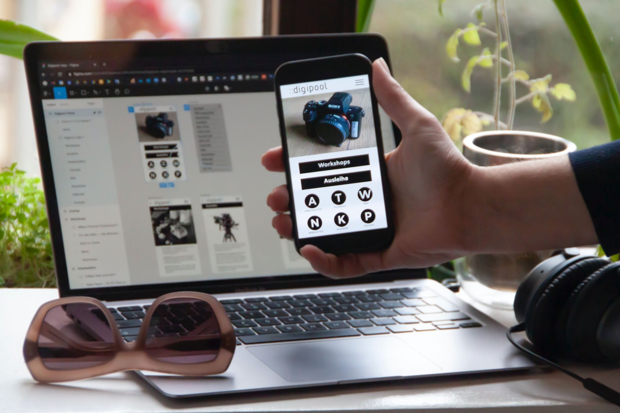
After working on web projects, I started the adventure of joining a mobile project for the first time. In terms of technology, we used Flutter with Dart, which made the experience quite enjoyable since Flutter provides you with a series of components that facilitate the basic assembly of the structure of a screen. I was also able to find several similarities such as the state handling, the structure based on columns, rows, containers, and the way components are arranged. In spite of that, I found some differences that caught my attention since they were related to the tool that the user handles and go beyond the language used. If you are interested in knowing more about Dart, you can watch the following talk.
To better understand the differences, it’s necessary to analyze them in relation to the tools used in each case.
On the web, the user uses a keyboard and a mouse that allows them to type quickly and click accurately. In relation to this, we can say that on a web page, we can count on the user to find it easy to type and click to navigate or enter information.
Analyzing these two interactions we can draw the following conclusions:
- Navigation: from the side of the same page there are links or buttons that allow you to go to another page. As for the location of these elements, they are usually placed in the upper section of the screen, where the user can find them quickly.
- Entering information: for this, the most common is to find inputs or dropdowns, where the user can fill out forms more easily thanks to the keyboard, therefore, it implies more extensive forms compared to mobile.

On mobile, users use their fingers which, on the one hand, are a bit clumsy to select something small with certainty or it’s tiring to type all the information. On the other hand, they can easily hold down and drag their finger across the screen, so they can take advantage of the different movements they make. This translates into having a wide variety of gestures to catch the drag, hold and drop interactions. Moreover, it requires that the spaces to be interacted with be large enough for the size of the finger or have enough space so that they do not conflict with other components.
Taking this into account we can draw the following conclusions:
- Navigation: contrary to the web, if we want the user to turn pages, we can consider the possibility of having them do so by dragging his finger to the sides. As for the location of the navigation bar, it’s placed in the lower section, which is closer to the user's hand. Following the same criteria, we place the accesses to the most important pages closer to the side of the hand with which the user interacts with the cell phone.
- Entering information: it should be designed so that the user has to type as little as possible. In the case of having to enter information, we can consider other tools that require interaction through gestures. For example, to enter a number we use a slider so that the user does not have to enter a number with the keyboard. We also have to take into account that when using a keyboard it occupies almost half of the available space, therefore, all the relevant information for the person along with the input must be contained in that reduced space.
Furthermore, using the camera scanner, fingerprint detection or face detection serves to facilitate the input or display of information or identification of the user.

On the web, we use primarily large screens and the tab in which the page is being viewed can be adapted to smaller sizes as available to the user. It’s also necessary to think about the possibility of opening the page from a cell phone, even knowing that it’s not going to be the most comfortable for the user since it’s focused on the use of a mouse and keyboard. Taking this into account, we can think of the web page as something that will generally occupy a large size, which we can take advantage of, but without forgetting that it has to adapt to smaller sizes and not die trying.
In programming, this translates into having to make the components responsive depending on the size of the screen and how these components will be accommodated in case the space is very small. There is also a form of design called Mobile-first where you start with the mobile design and then adapt it to tablets and computers. The design is thought first with the essential elements in a reduced and simple way. This makes it easier to adapt it to larger spaces and add more elements if necessary.

In mobile, the screens are smaller, they can change a little depending on the type of cell phone but it’s still in a reduced area of space compared to a monitor. That is why it’s necessary to think about the design in a way that everything fits in a reduced way and, at the same time, the components remain large enough so that users can see them clearly and interact with them. Having so little space means having to think about what the essential elements of the application are. Unlike the web, screen changes do not imply big changes in the layout of the elements, but the size of the components is adapted according to the width and length of the screen. Therefore, the design starts from the smallest cell phone model and then adapts to a larger one.

- Conclusion:
Based on my experience, I can conclude that moving from web to mobile implies having to deal with other types of problems and learning to use the tools that help to solve them. Also, having a knowledge base, which is shared on both platforms, makes adaptation much easier. After that, there is only the difficulty of learning a new language. There are more differences, but I mentioned the ones that most caught my attention when I started with this experience and that I found on a daily basis.